Beneflo
Beneflo is a SaaS platform for managing corporate benefits and compensations. The system connects employers, insurance providers, and employees, automating calculations and benefit distribution. My task was to design an interface that simplifies the administration of complex financial schemes and makes the benefits selection process transparent for the end user.
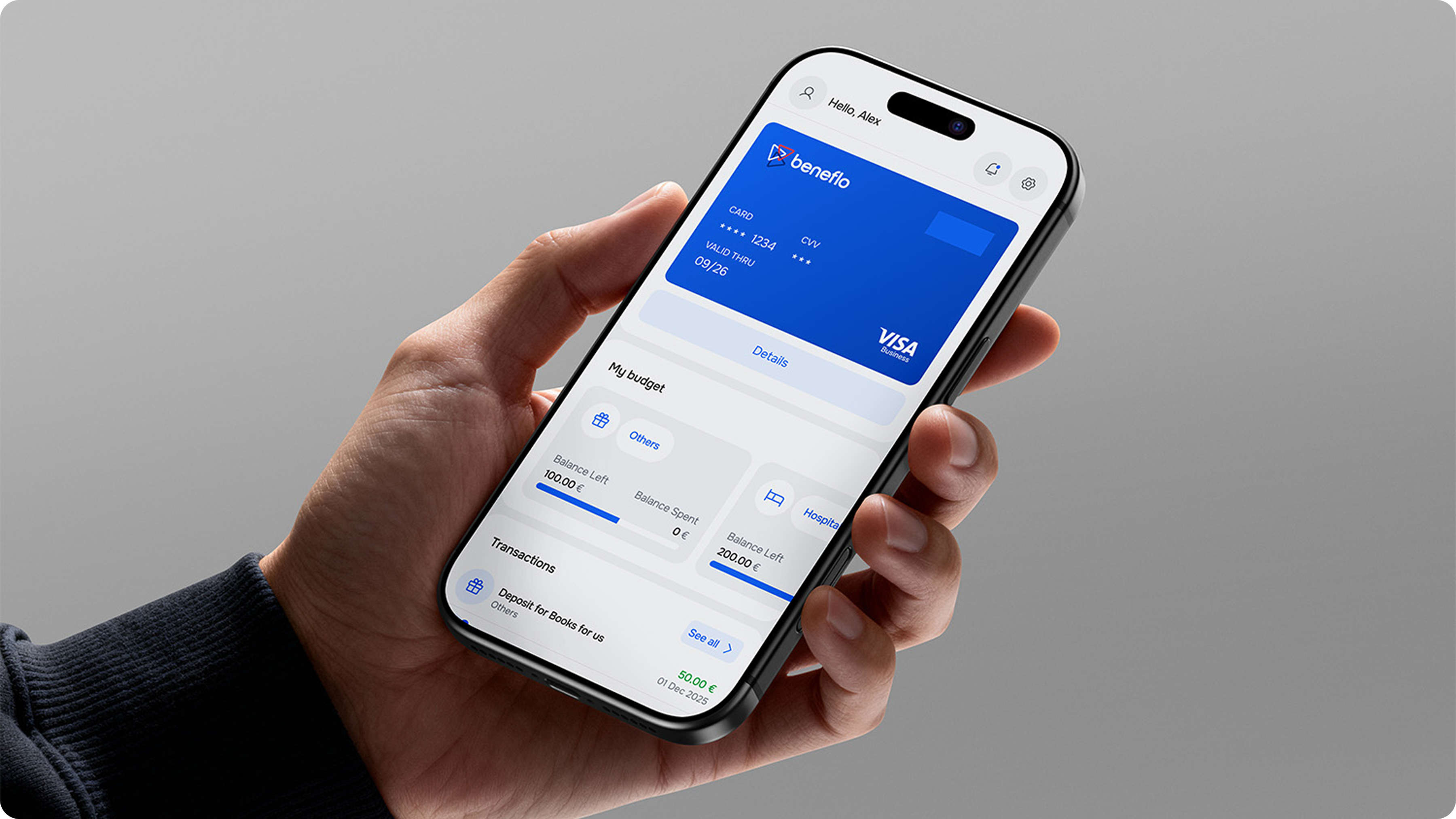
results
The shift to a new interaction logic took the platform to a whole new level of efficiency.
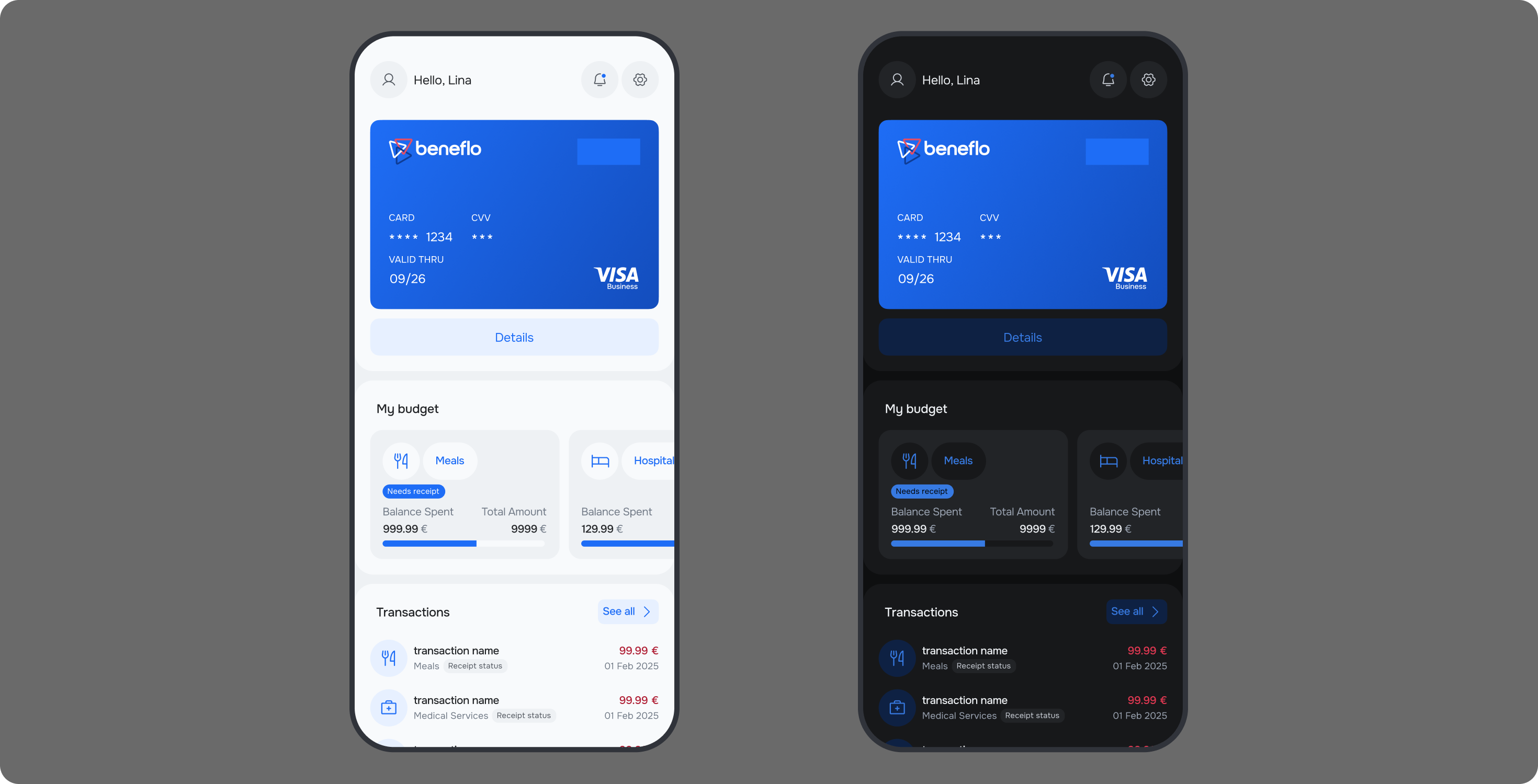
context
I joined Beneflo during its pilot and post-launch phase: the product already worked, but it had to be prepared to scale onto new corporate clients. It's a B2B2C platform at the intersection of fintech and HRtech — the employer configures and buys benefit packages, the employee uses them, and insurance and financial providers sit behind the calculations.
As the senior designer I owned the admin experience, the employee journey, and the patterns the platform could grow on: validation, states, and budget visualization. Three sides, a regulated financial domain, and a lot of rules — while the interface had to stay clear to each participant.
problems
The administrator was drowning in manual setup: every new client was assembled almost by hand, with no ready preset system.
Errors in financial data were expensive — wrong accruals, extra load on support and HR, lost client trust.
The employee couldn't tell what their choice affected: the link between a benefit and final compensation was unclear, and the questions leaked into HR.
solutions
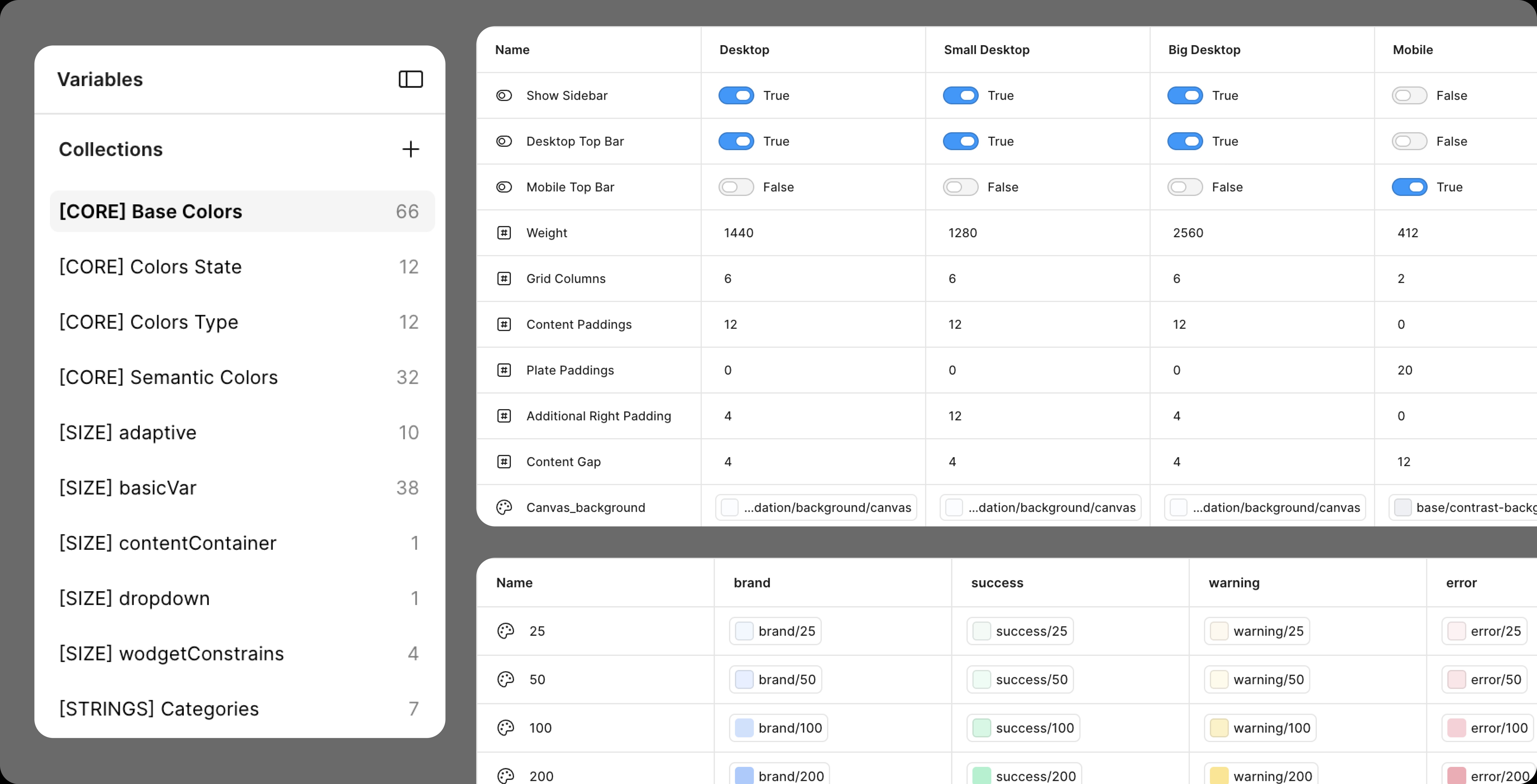
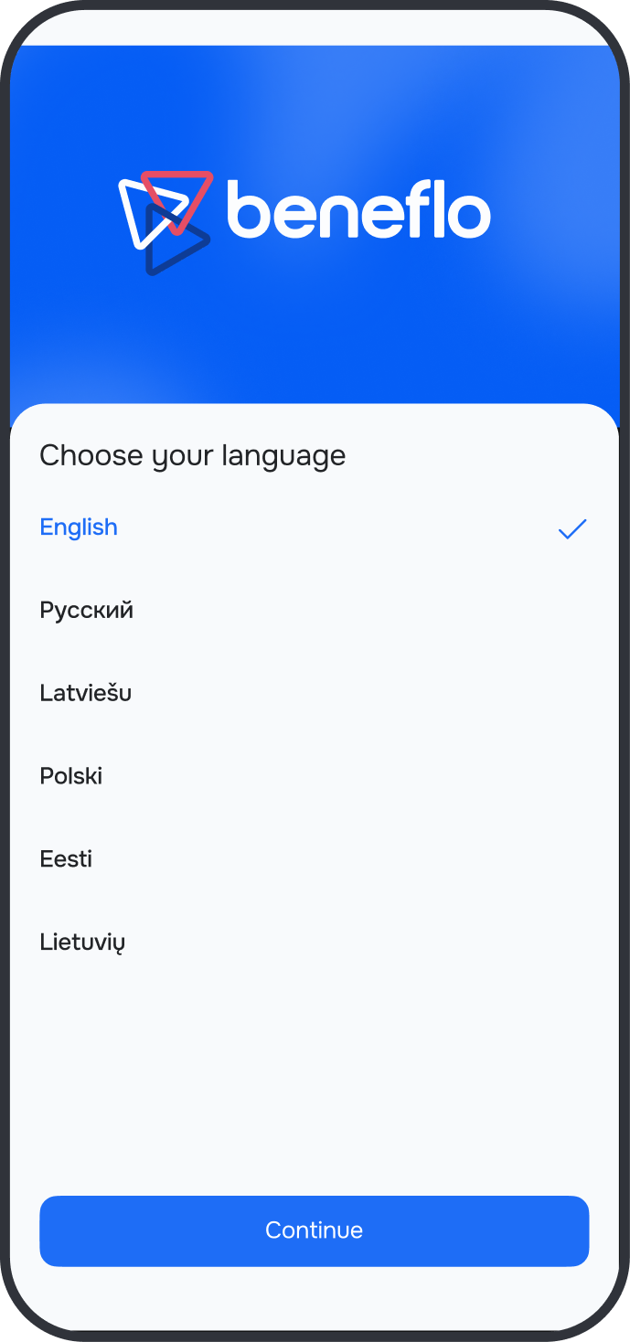
I worked on building a scalable design system able to support different levels of platform customization. The main focus was on designing modular interfaces for the admin panel, where I introduced automated flows for managing tax deductions and insurance plans. This cut system setup time for new clients.
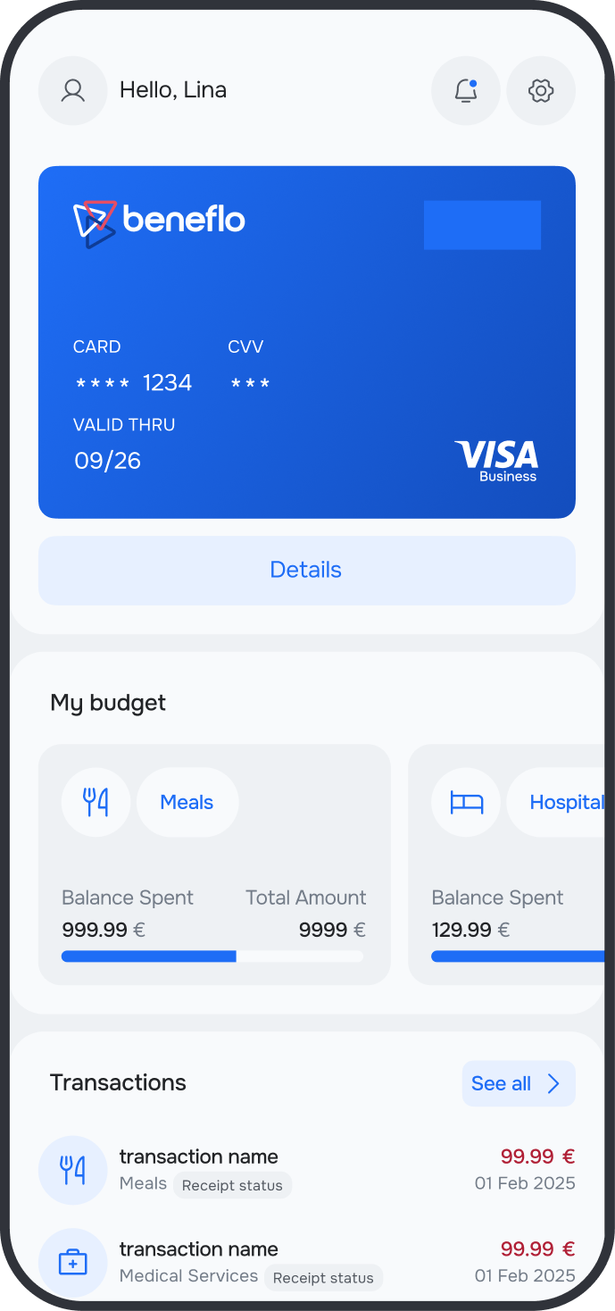
Special attention went to budget visualization: users now clearly see how their choices affect the final compensation amount in real time. This solution minimized confusion and the number of clarifying questions to HR teams.
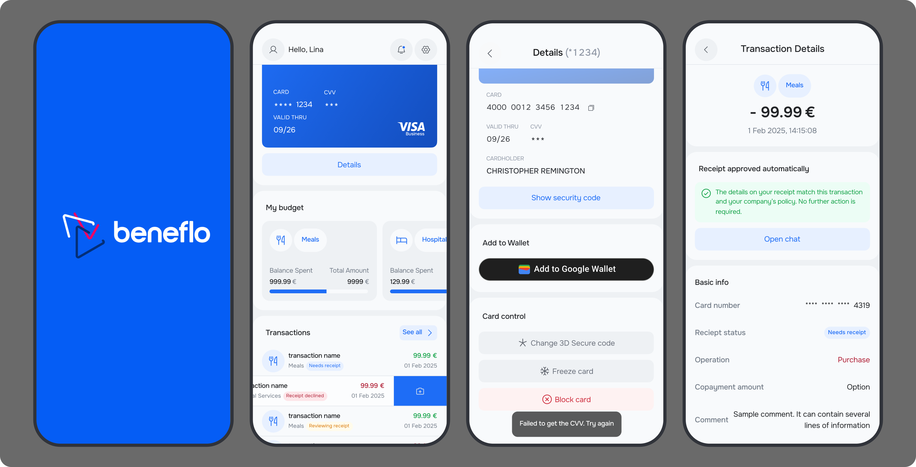
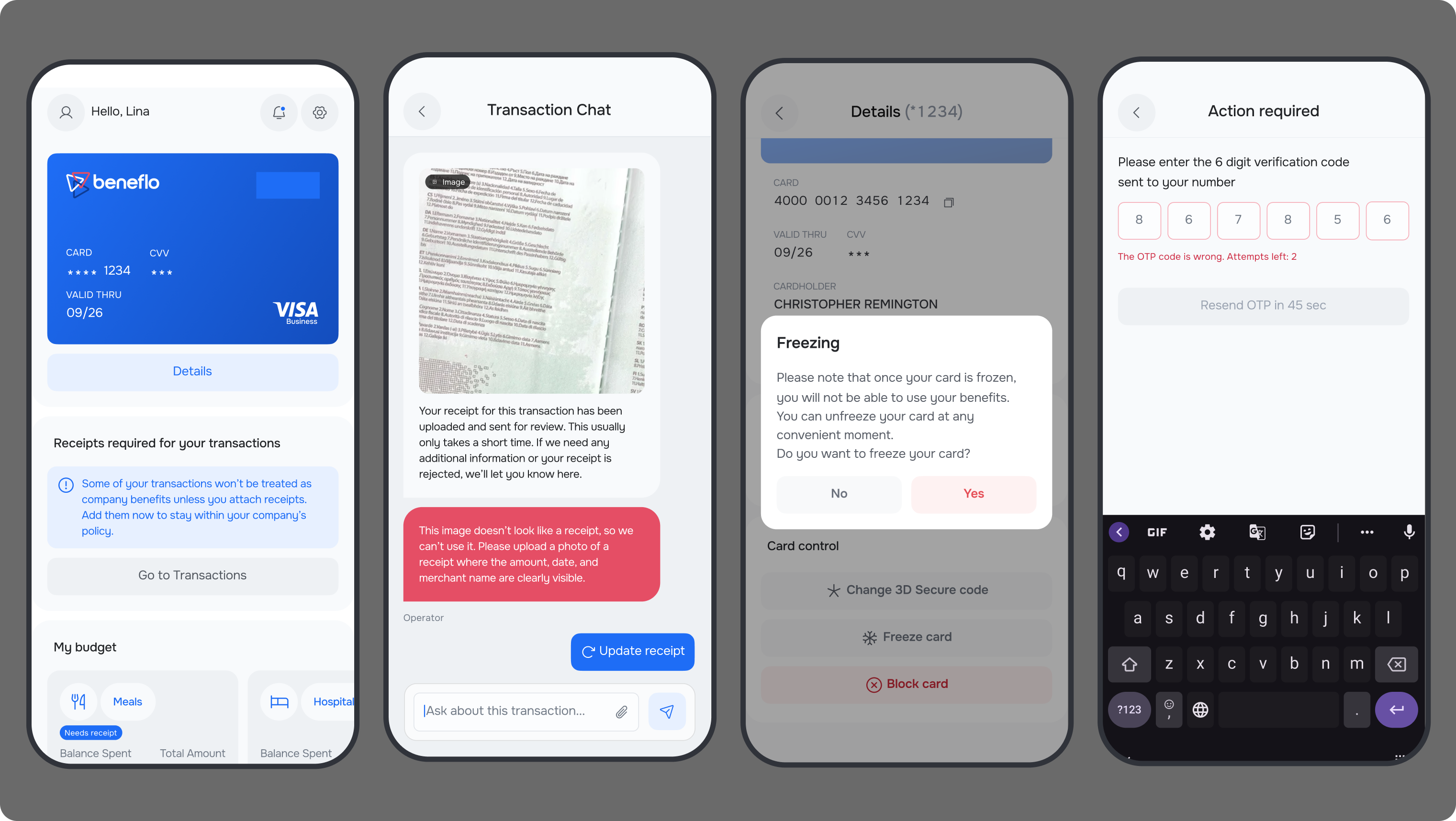
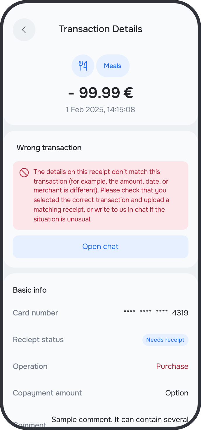
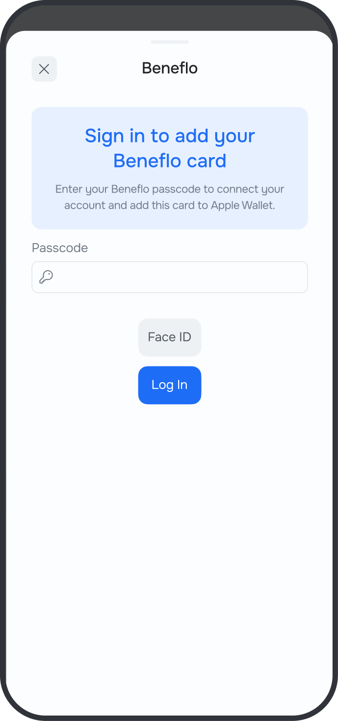
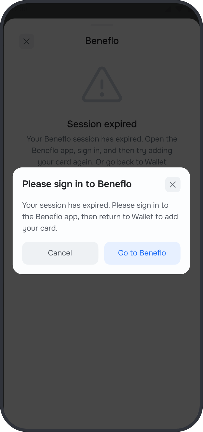
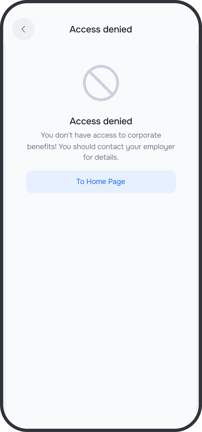
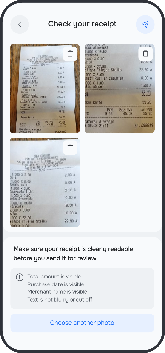
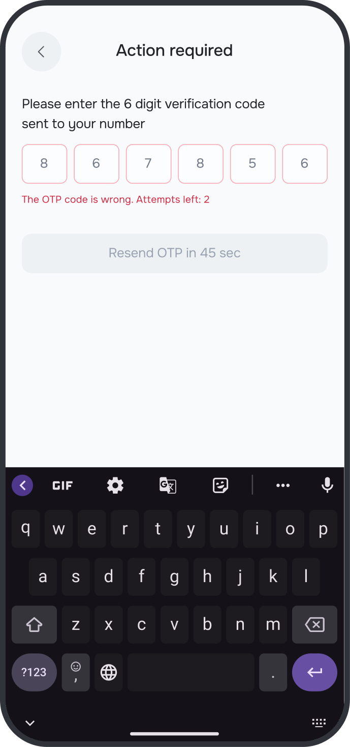
Financial data doesn't forgive mistakes, so I designed not just the states of individual elements but the whole conversation the system has with the user: alerts that a receipt needs to be attached, clear explanations of why an uploaded document didn't qualify, confirmations before irreversible actions like freezing a card, handling of a wrong OTP with the number of attempts left.
Each of these moments went through a couple of iterations and tests: I kept rewriting the wording and the logic of the prompts until it became hard for the user to get lost. It was these guiding moments, not field validation alone, that brought down the number of errors in financial data.
user journeys
The product lived on two sides — configuration for the admin and understanding for the employee. Each journey was designed to remove friction before it turned into an error or an HR question.
the hardest call
The core tension of the whole project was flexibility versus control. Clients asked for maximum customization: their own rules, their own categories, their own exceptions per country. The temptation was to build a configurator where almost anything could be set up.
I turned that path down. Infinite customization would have meant every new client was manual assembly all over again — another chance for errors in financial data, another rise in support cost. Exactly the problems we were trying to remove.
Instead of a build-anything configurator I chose managed modules: a library of presets and rules that a client configuration is assembled from. Flexibility stayed where it was genuinely needed, but within proven blocks — not as an empty field where anyone could go wrong. The decision cost some "flexibility on paper," but it's what delivered the biggest gains in onboarding speed and error rate.
interfaces
team
The project required close work with analysts and financial consultants to accurately reflect legal nuances in the design.
a note
A couple of thoughts I took away from the project, and would have kept pursuing had I stayed on it longer.
I wanted to see more clearly where administrators stumble during setup — from data, not from a hunch — so presets and hints could be refined more precisely. And to explain available benefits to an employee through their own context, rather than the same for everyone. A separate thread is the reuse rules for components and states: so a growing platform doesn't fragment into local solutions, and the systemic quality the whole effort was for is preserved.
next
contacts
currently shaping products at TLM