iRobot
iRobot is an American company and one of the world's leading consumer robotics manufacturers, best known for its Roomba line of robot vacuums. Founded in 1990, the company actively develops its smart home, automation, and robotics directions.
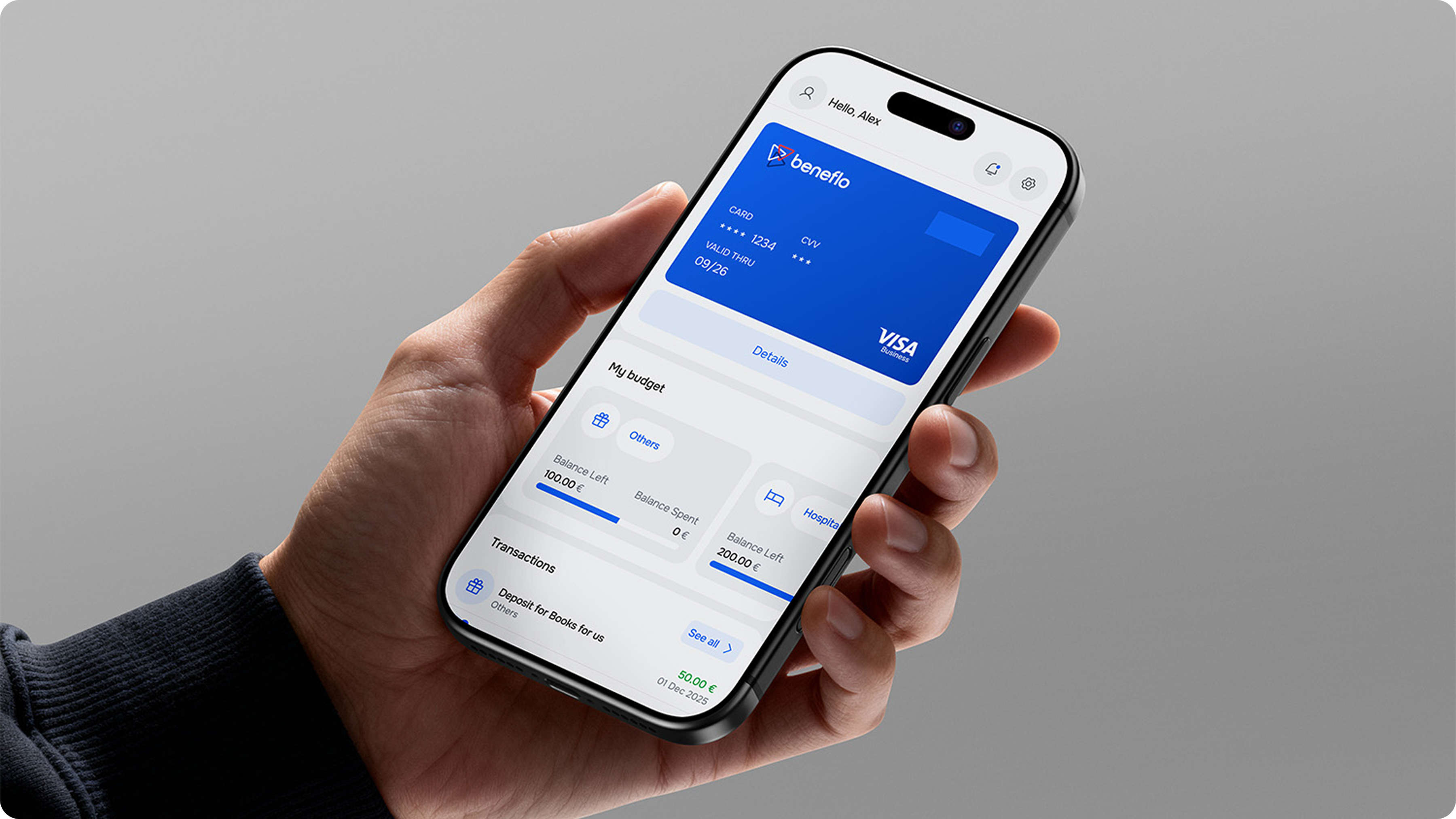
Roomba Home is a new mobile app by iRobot, built from scratch to manage the current generation of robot vacuums. It lets users easily and flexibly configure robot behavior, control cleaning, monitor device status in real time, and automate routine household tasks.
results
The implemented updates drove meaningful growth across the app's key performance metrics.
problems
The redesign was driven by a gap between the technological potential of the new robots and the current user experience — reflected in the app's average rating of 3.8/5. Feedback analysis revealed that 65% of users found cleaning, map, and schedule setup too complex, while the interface couldn't visualize the new 3D maps and advanced automation.
Mixpanel Insight: the high interaction cost leads to drop-off before cleaning begins.
Additional barriers included non-compliance with WCAG 2.1 accessibility standards and pressure from competitors offering more intuitive solutions.
The strategic goal of the project was to transform the product to reach NPS 80 and grow engagement by 20%, through the launch of an inclusive, high-tech interface in early 2026.
business frame
One of the first things I did as lead was formalize the link between design and business metrics — not to justify budget, but as a working decision tool and a shared language with product and engineering.
Every bit of friction in the interface isn't just inconvenience — it's a break in the business model. If someone doesn't start a clean because they "couldn't figure out the settings," the company loses money. That reframed how we talked to product and engineering: not "let's make it nicer" but "here's where we lose conversion, and here's what it costs."
insights
Research ran across four layers — product analytics, interviews, usability testing and a steady stream of store reviews. A few non-obvious findings shaped the whole direction.
strategy
One of the most important product decisions — from design, and from me as lead — was reframing the core problem we were solving.
This isn't semantics — it changes the whole solution architecture: instead of shortening onboarding, we invest in capturing context and explaining why it matters. The difference between "fill out a form" and "tell us about your home and we'll clean smarter."
The reframe meant aligning the data team (rebuilding the recommendation model), product (infrastructure invisible to the user) and engineering (real technical cost). Before locking the direction I ran a round of customer-development interviews, so stakeholder reviews ran on validated hypotheses rather than opinion.
solutions
I joined this program mid-flight in June 2024 as the embedded senior designer, working alongside the in-house design lead, product and engineering. The first three solutions here are mine end-to-end; the from-scratch rebuild and the map-first architecture were already underway when I arrived, and I designed within them.
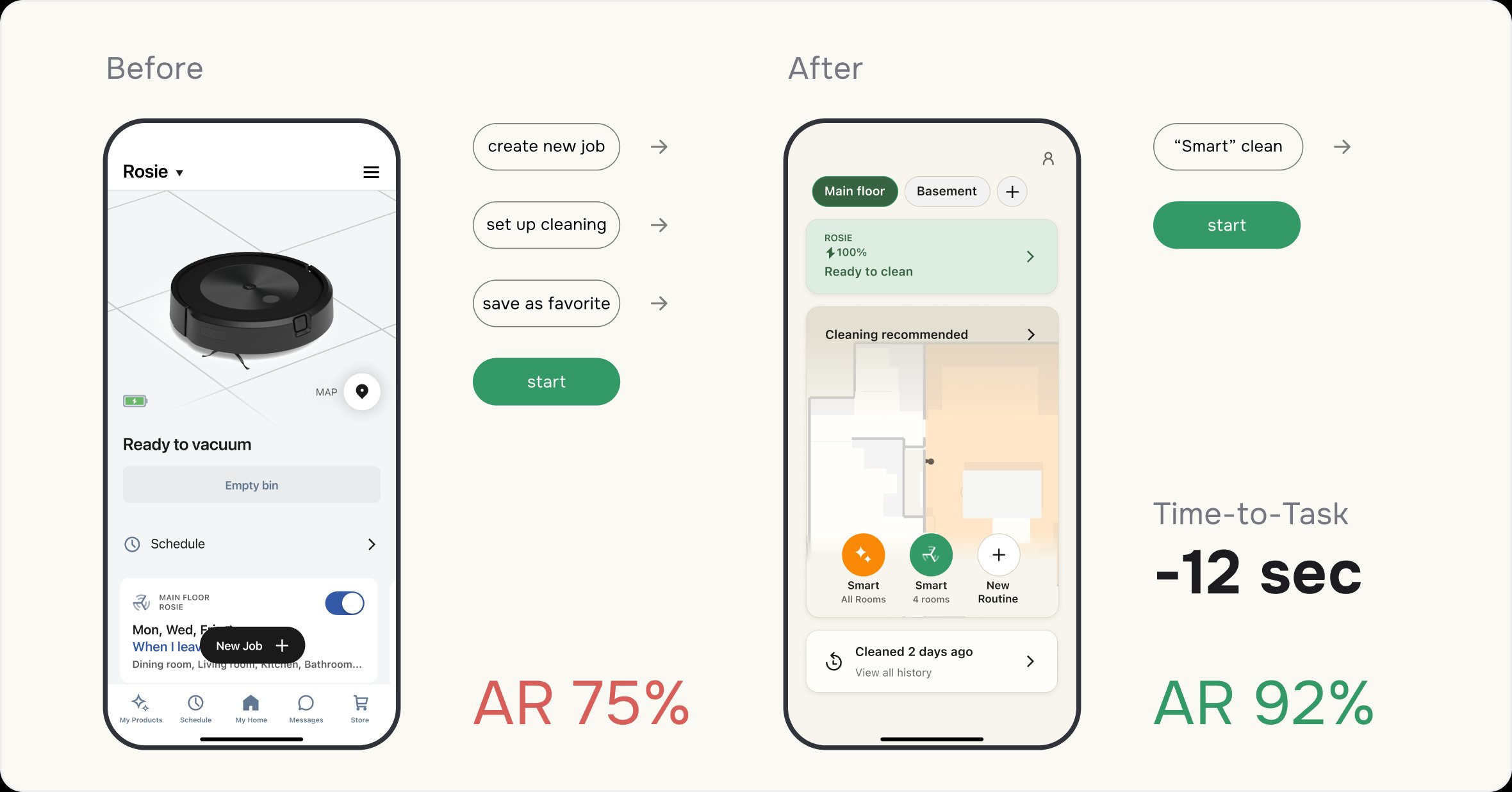
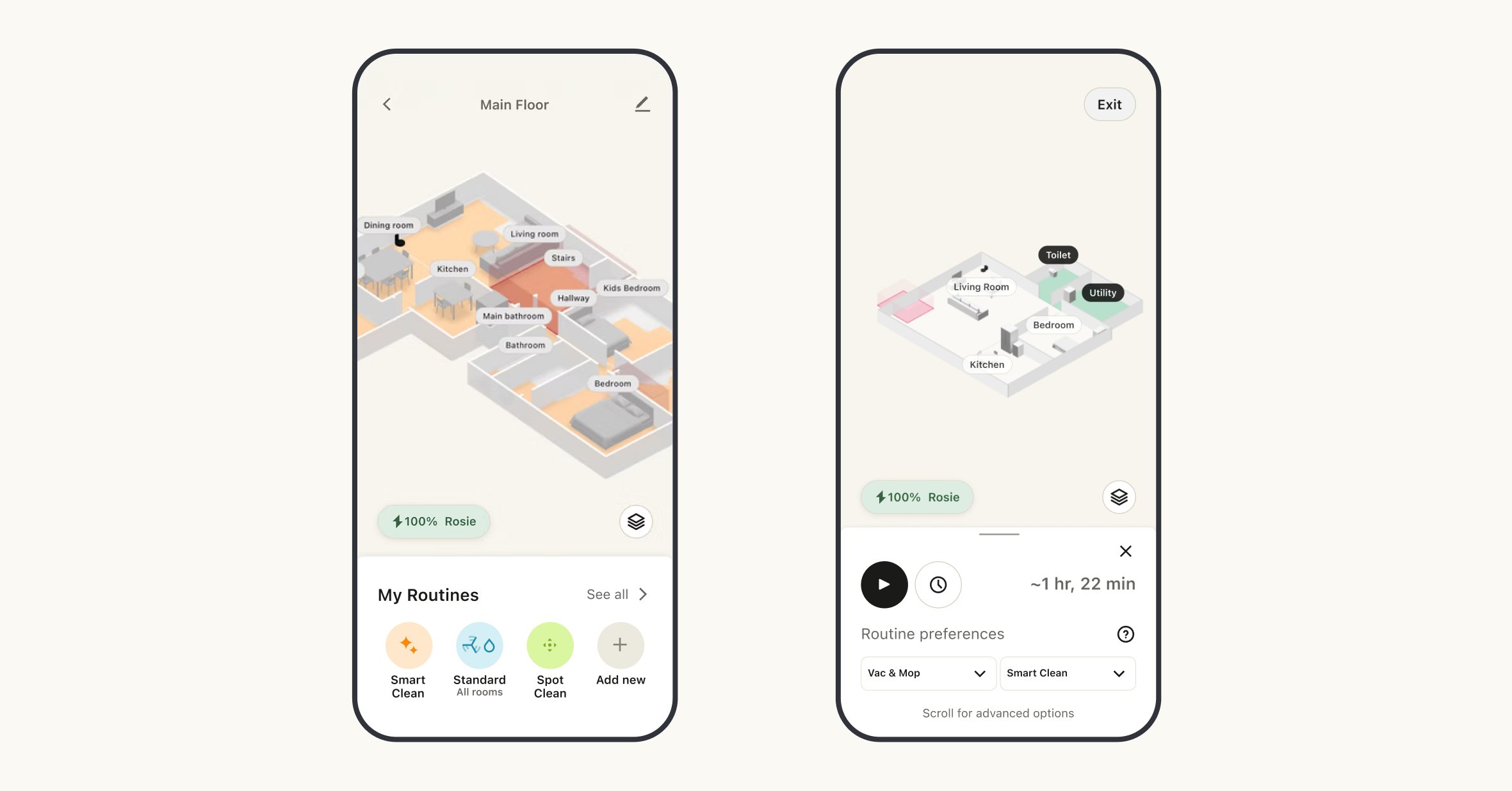
Smart Clean was a team hypothesis: instead of making people configure every clean, surface the most likely one. With Data Science and the design lead we built it, and I owned the iterative rollout — analyzing feedback in detail. At launch I made the entry point as fast and obvious as possible; after several iterations, once users had learned the feature, I shifted focus from the "sellable" feature toward overall screen usability.
The old multi-step path — create a job, set it up, save, start — collapsed into two taps: "Smart clean → start." The robot begins with the rooms that need it most, no extra setup — cutting 12 seconds off time-to-task.
Particular attention went to implementing inclusivity standards (WCAG 2.1) and optimizing the interface for VoiceOver, which expanded the product's accessibility for all user groups.
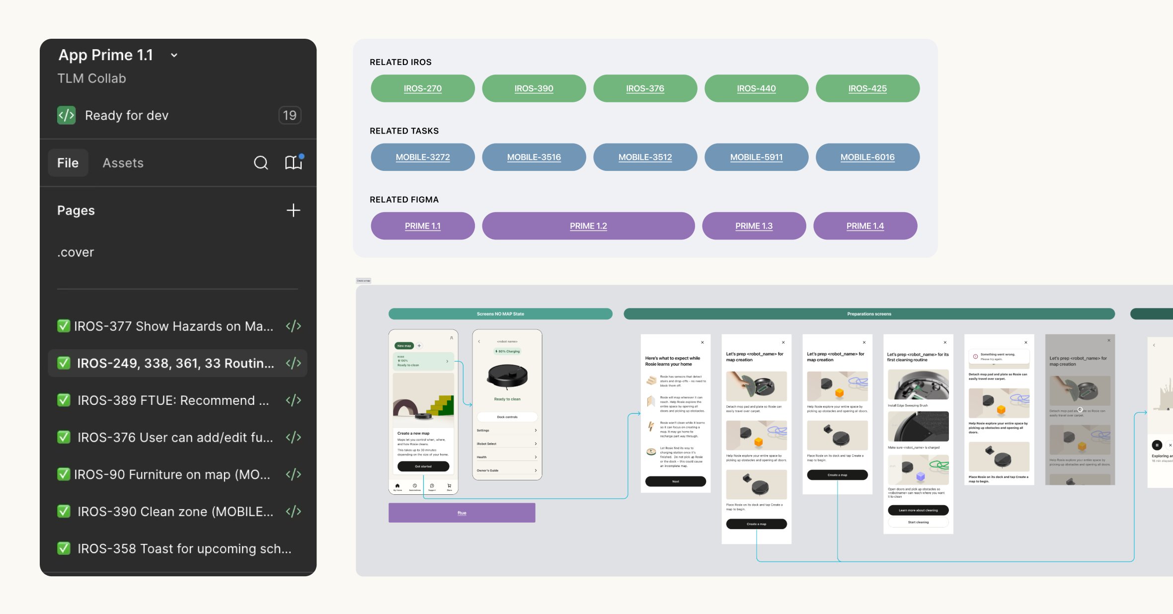
I focused on stabilizing the delivery pipeline. We introduced strict status-model rules, established a single source of truth, and integrated a Design Freeze practice before handoff to development. This wasn't just a tooling question but a cultural shift: we built clear "rails" along which design, engineering, and Data Science began moving in sync.
Roomba Home isn't a redesign. The old architecture couldn't support the new robot capabilities. We built the system from scratch: new navigation, a new map, new recommendation logic, a new language of interaction with the device. And all of it had to launch in sync with the hardware release — plus maintain App Flip compatibility for older robot generations.
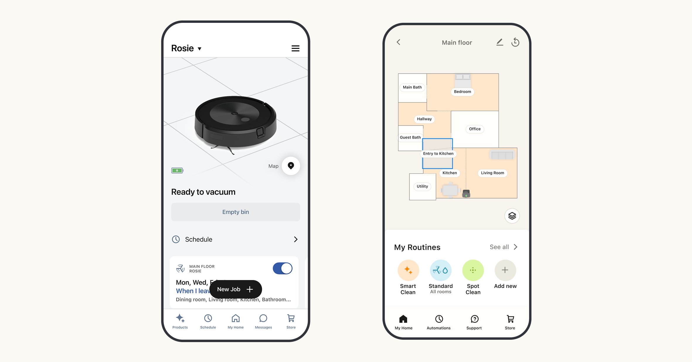
The new solution: the map isn't a background, it's the interface. Tap a room → it highlights green → the bottom panel appears automatically: cleaning time, mode, profile, "Start now" / "Schedule for later" buttons. Everything else sits under "Advanced settings."
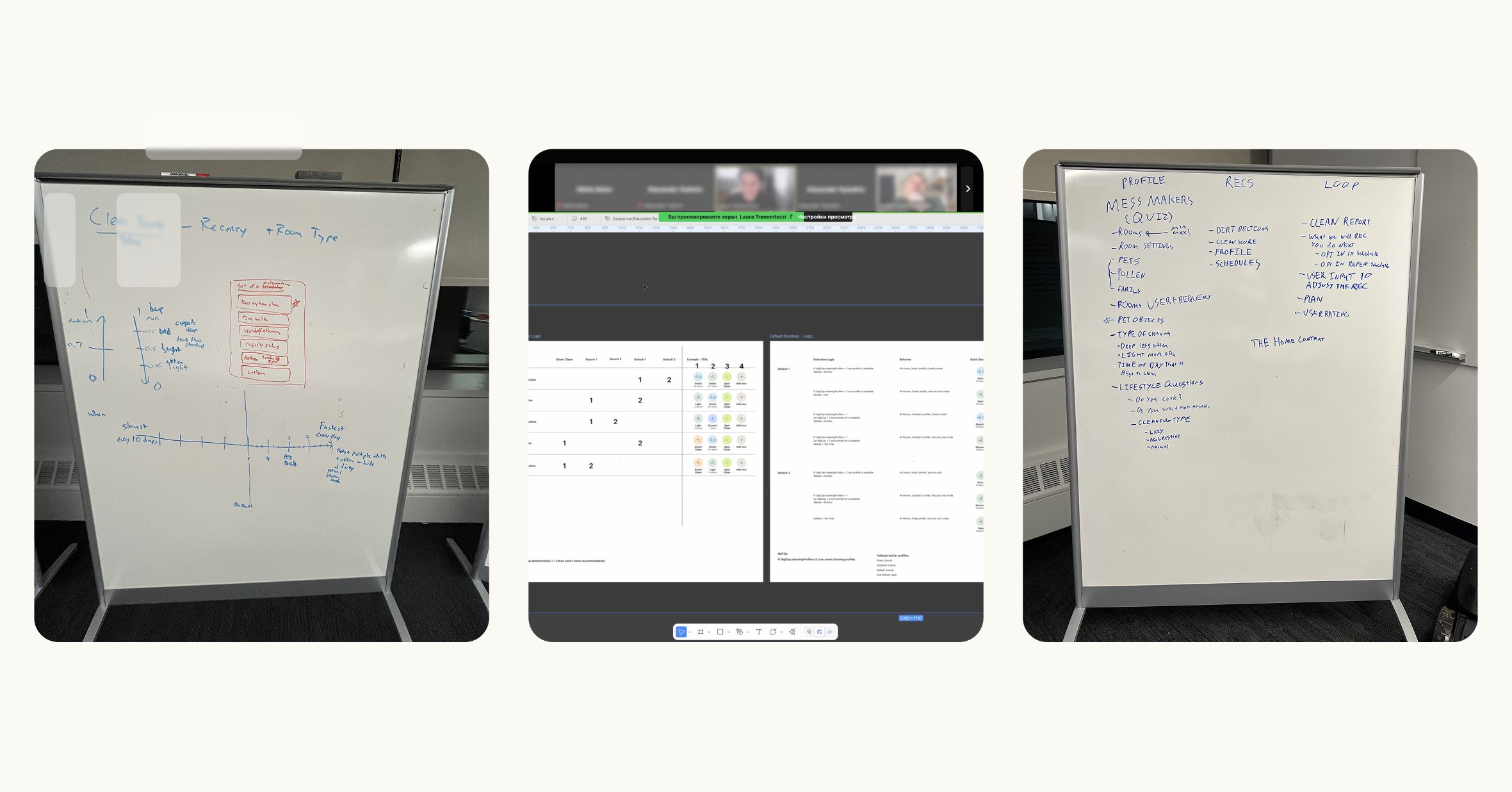
The design lead and I built the discovery rhythm like this: joint sessions → rapid prototypes → testing → data. I ran working sessions with the data analysts where we sketched on the board and worked through, in real time, which inputs drive dirt patterns and how user context should translate into model parameters.
user journeys
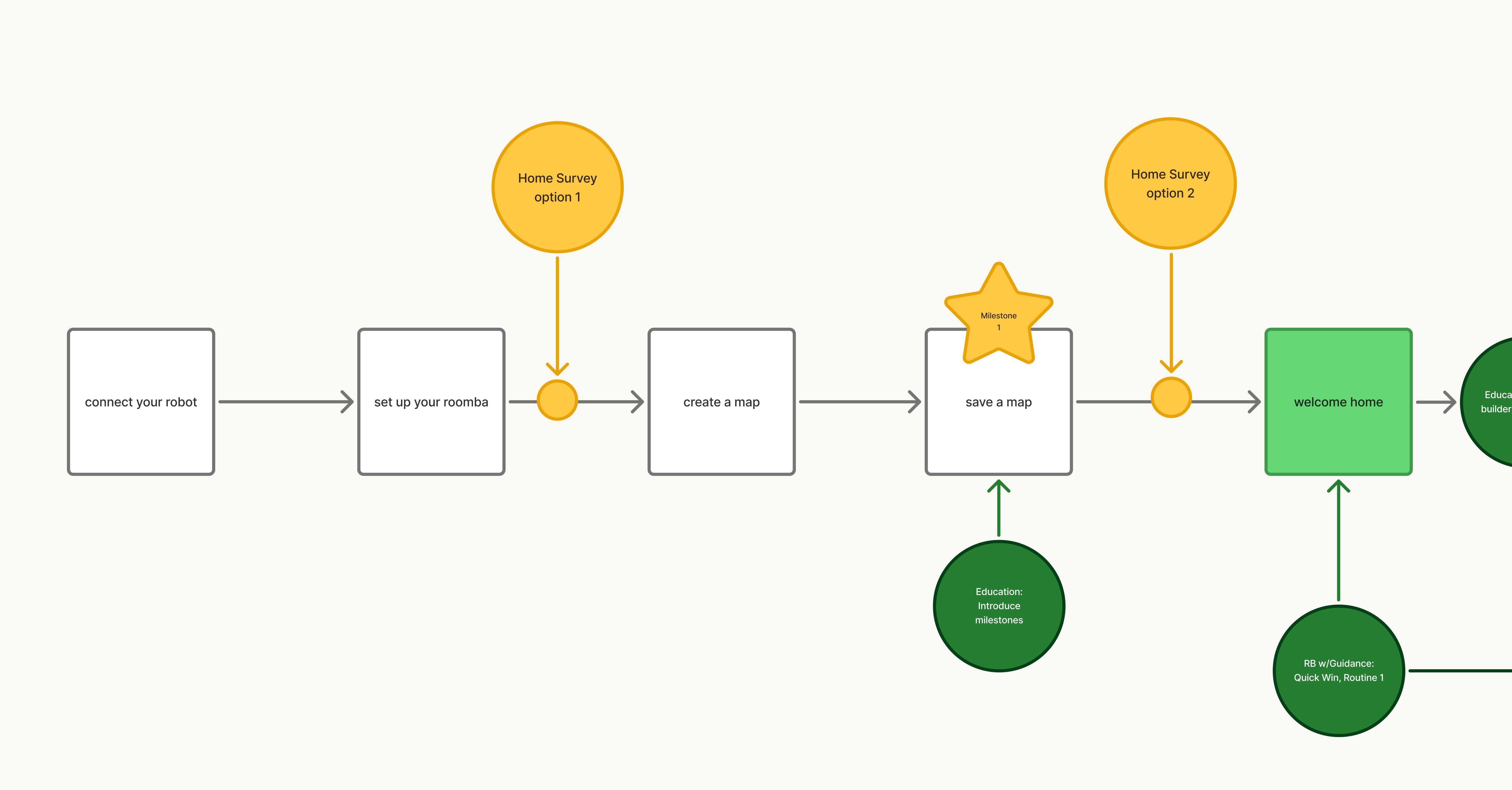
Key scenario: from unboxing to habit. A new user unboxes the robot → connects via the app → creates a home map → goes through Home Profile → sees a personalized cleaning profile → builds the first routine on the map → starts cleaning → after a few cycles the routine runs on its own.
Every transition used to be a drop-off point. Home Profile closes "setup with no payoff." Routine Builder closes "I have a map but don't know what's next."
the hardest call
The most telling decision from a leadership standpoint — and the hardest to make.
The new robots detect dirt concentration by zone, so the obvious move was to show it: per-room heatmaps, time series, zone comparisons. The data was rich and the visuals impressive — I'd personally invested time in several variants.
Testing broke the concept. People weren't overwhelmed by complexity — they didn't know what to do with it. Worse, a dirt heatmap read as an accusation — "is my home really that dirty?" — the exact opposite of help.
It was hard to defend: the data team had invested serious resources, and some stakeholders saw visualization as a competitive edge. The argument that landed — the data doesn't disappear, it powers the recommendation; the user sees the conclusion, not the numbers. The team kept the value of their work, and we kept the experience.
team
The work was done in close cross-functional collaboration. I acted as the bridge between product managers and developers, ensuring that every design decision was technically feasible and aligned with iRobot's strategic goals.
next